





You're a small business owner in Toronto, burning the midnight oil, trying to make sense of your GST/HST returns. Frustrated, you decide it's time to call in the pros. You pull out your phone and start searching for local accounting firms. What catches your eye? A sleek, user-friendly website that speaks your language, not financial jargon, and understands the unique challenges of Canadian businesses.
That, fellow Canuck, is the power of great website design in the Canadian accounting world.
In our vast and diverse country, from the bustling streets of Vancouver to the charming coastal towns of Nova Scotia, your accounting firm's website isn't just a digital business card—it's your round-the-clock salesperson, your brand ambassador, and often, the deciding factor for potential clients.
Ready to unlock the secrets of websites that turn visitors into clients faster than you can say "hockey night"? Grab a double-double and let's explore the crème de la crème of Canadian accounting and bookkeeping websites!
Showcasing the Best: Top Canadian Accounting & Bookkeeping Websites
Let's explore some standout examples from across the Great White North and dissect what makes them so effective.
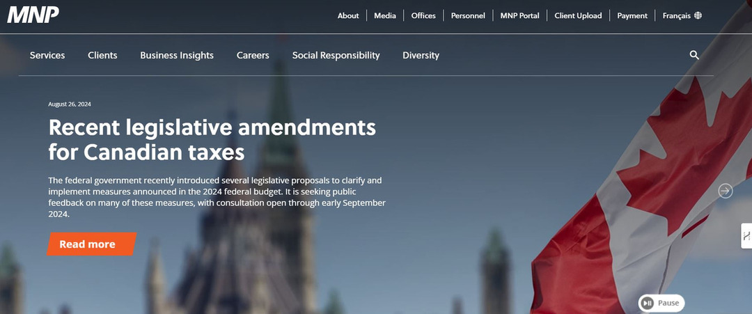
MNP LLP
What Makes It Shine:
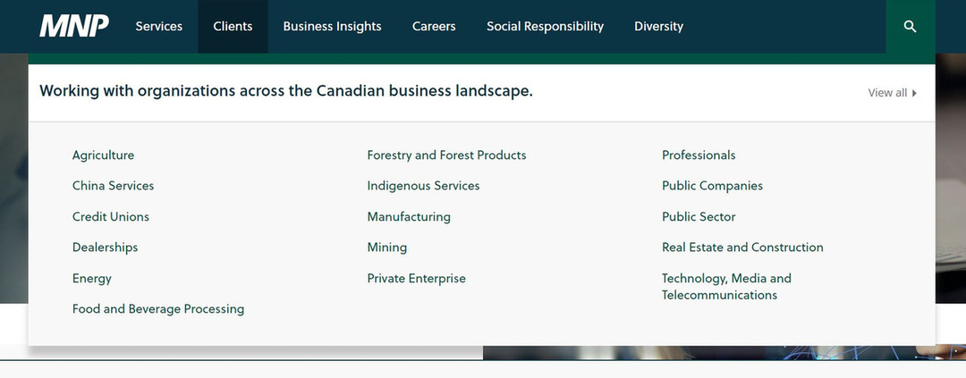
Clean, professional design with a distinctly Canadian feel
Clear navigation highlighting services tailored to Canadian businesses
Provincial selection feature to provide location-specific information
Prominent "COVID-19 Business Advice" section, showing adaptability to current Canadian business challenges
Bench Accounting
What Makes It Shine:
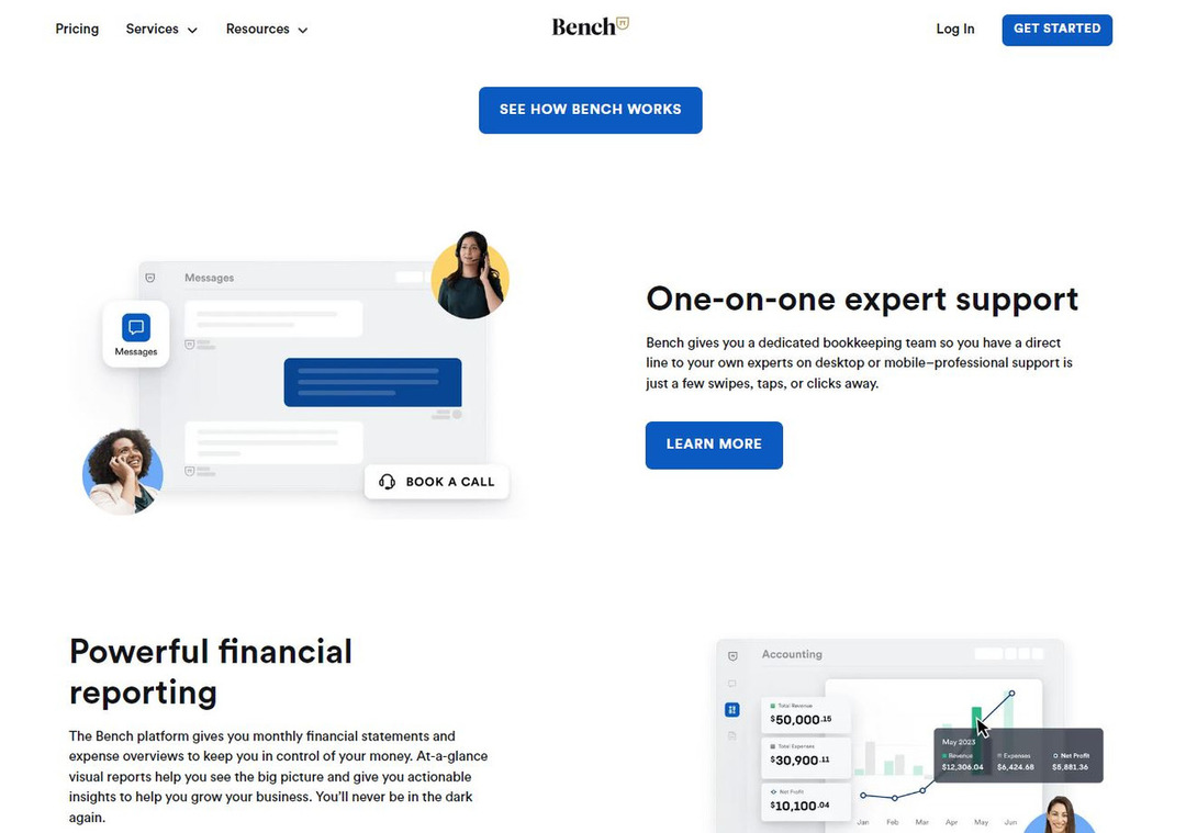
Bold, colorful design that breaks the "boring accountant" stereotype
Clear value proposition addressing pain points of Canadian small businesses
Interactive pricing calculator in CAD
Customer testimonials from recognizable Canadian brands
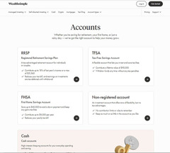
WealthSimple Tax
What Makes It Shine:
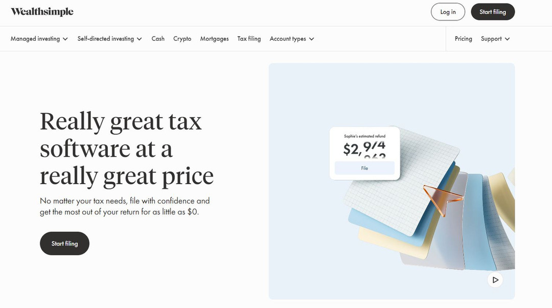
Minimalist design focusing on the simplicity of Canadian tax filing
Clear messaging about being "Made in Canada for Canadians"
Prominent display of compatibility with CRA systems
Integration of Canadian-specific tax terms and concepts
FreshBooks
What Makes It Shine:
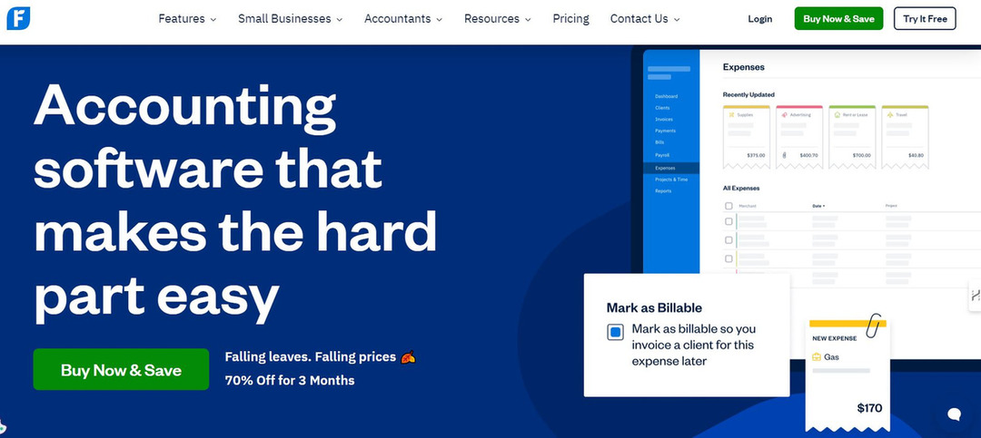
Intuitive user interface mirroring the simplicity of their product
Use of soft, approachable color palette reminiscent of Canadian landscapes
Clear segmentation of services for different Canadian business types
Prominent display of Canadian dollar pricing and compatibility with Canadian tax rules
Design Elements That Work for Canadian Accounting & Bookkeeping Websites
Now, let's break down the key design elements that make these websites so effective, with a distinctly Canadian twist:
Color Schemes
Tip: Use a professional color palette with Canadian-inspired accents.
Specific Advice:
Start with a neutral base (whites, greys, or soft beiges) for a clean, professional look.
Consider using red as an accent color to subtly reference Canadian identity.
Use cool blues and greens as secondary colors to evoke Canada's natural landscapes.
Layout
Tip: Employ a clean, grid-based layout that accommodates bilingual content.
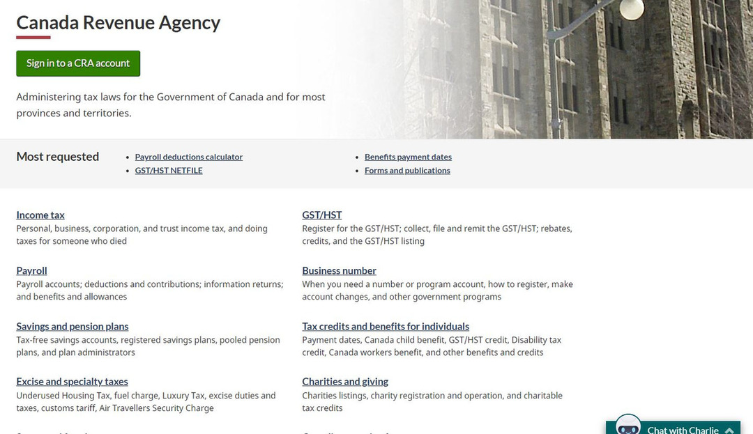
Specific Advice:
Use a 12-column grid system for flexibility in design across different screen sizes.
Implement the "F-pattern" layout, placing key information along the top and left side of the page.
Design with bilingual content in mind, allowing space for text expansion in French.
User Interface (UI)
Tip: Prioritize clarity and simplicity in your UI design, with Canadian-specific features.
Specific Advice:
Use consistent button styles throughout the site. Consider using rounded corners, which are often associated with a friendly, approachable Canadian aesthetic.
Implement hover effects on interactive elements to provide visual feedback to users.
Include Canadian-specific UI elements, such as province/territory selectors or Canadian dollar indicators.
User Experience (UX)
Tip: Focus on creating a smooth, intuitive user journey tailored to Canadian users.



Specific Advice:
Implement a clear value proposition above the fold on your homepage, addressing Canadian business pain points.
Use a sticky header with key navigation elements and a prominent "Contact Us" or "Get Started" button.
Include FAQ sections addressing common questions for Canadian businesses, such as GST/HST handling or cross-province operations.
Typography
Tip: Use clean, readable fonts that work well in both English and French.
Example: The Big Four accounting firms in Canada all use clear, modern sans-serif fonts for body text, enhancing readability in both official languages.
Specific Advice:
Choose a sans-serif font like Open Sans, Roboto, or Lato for body text.
Use a font size of at least 16px for body text to ensure readability.
Ensure your chosen font has good support for French accents and characters.
Responsive Design
Tip: Ensure your website looks great and functions well on all devices, considering Canada's vast geography and mobile usage.

Specific Advice:
Use a mobile-first approach when designing your website, as 88% of Canadians own a smartphone [1].
Implement breakpoints at common device widths (e.g., 320px, 768px, 1024px) to adjust layout.
Ensure touch targets are at least 44x44 pixels on mobile devices for easy interaction, especially important for users in colder regions wearing gloves!
Practical Tips for Implementing Effective Design
Know Your Audience: Tailor your design to your target clients. Are they tech-savvy startups or traditional businesses?
Prioritize Content: Ensure your services, value proposition, and contact information are easy to find.
Use High-Quality Images: Invest in professional photography or high-quality stock images that reflect your brand.
Implement Clear Call-to-Actions (CTAs): Guide your visitors towards desired actions with clear, compelling CTAs.
Optimize Load Speed: A beautiful website is useless if it's slow. Optimize images and code for quick loading times.
Showcase Expertise: Integrate a blog or resources section to demonstrate your industry knowledge.
Include Social Proof: Display client testimonials, case studies, or logos of companies you've worked with.
The Impact of Good Design on Business Growth
Investing in good website design isn't just about aesthetics—it directly impacts your bottom line. According to a study by Forrester, a well-designed user interface could raise your website's conversion rate by up to 200%, and a better UX design could yield conversion rates up to 400%.
For accounting and bookkeeping firms, this could mean the difference between a potential client choosing your services or clicking away to a competitor.
Conclusion
Your website is your digital handshake—make it firm, professional, and unmistakably Canadian. By implementing these design principles and drawing inspiration from standout Canadian accounting websites, you can create an online presence that resonates with clients from coast to coast to coast. Remember, in the world of Canadian accounting websites, your design should be as balanced as the national budget aspires to be!
Ready to create a website that impresses more than a perfectly executed triple axel? Don't let web design complexity leave you stuck in the penalty box. With Nilead's AI-powered platform, you can create a high-converting website that showcases your expertise and attracts more Canadian clients.
Schedule your free discovery session today and learn how Nilead can help you design a website that's as impressive as the Canadarm. Let's make your online presence your best asset!
Table of contents

About the author