Let’s get real: high bounce rates on a real estate website don’t always mean your offer sucks. Most of the time, it’s the experience that’s broken.
But how do you figure out where people are dropping off — and why?
Here’s the no-BS guide to finding the bounce culprits and fixing them fast.
Install a session replay tool (like Hotjar, Clarity, or FullStory) and watch what people are doing.
What to look for:
Rage clicks (when users click repeatedly out of frustration)
Mouse freezes on confusing sections
Scroll-stops just before key CTAs
These show you where the friction is happening — before they bounce.
Pro tip: If visitors aren’t even scrolling past the hero image, your first impression isn’t working. Rethink your headline and trust signals.
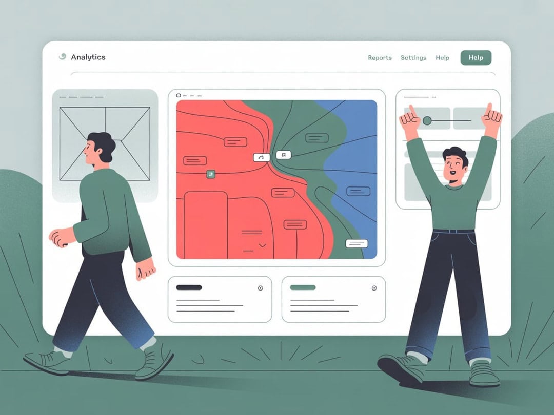
Heatmaps don’t just look cool — they tell you if people are ignoring your calls to action, missing important info, or getting distracted.
What to fix:
Too many choices (menus with 10+ links = analysis paralysis)
CTA blindness (if no one’s clicking “Schedule a Visit,” it might be invisible or uninspiring)
Weird content gaps (huge whitespace or filler text = scroll drop-offs)
Don’t redesign the whole site after 3 bad sessions. Instead, test one tweak per section:
Swap the hero banner with a version that includes a trust stat or testimonial
Change “Get in Touch” to something warmer like “Let’s Plan Your Visit”
Cut form fields from 6 to 3 (most people bounce at form overload)
Run A/B tests using tools like Google Optimize, VWO, or even manual split traffic.
Pop up a quick exit survey when someone’s about to leave:
“Before you go — was anything confusing or missing?”
You’ll be surprised how many people do respond — and give honest gold like:
“Didn’t know where to start”
“Not sure if this is for investors or first-time buyers”
“Too salesy”
Turn that into clearer copy, better segmentation, or a smarter homepage flow.
TL;DR:
Don’t treat bounce rate like a black hole. It’s just feedback you haven’t translated yet.
To fix bounce hotspots:
Track behavior with tools (rage clicks, scroll maps, exit surveys)
Pinpoint unclear messaging or poor hierarchy
Run small tests and iterate fast
Make sure people know exactly what to do next on every scroll
The more you reduce friction and increase clarity, the longer people stay — and the faster they convert.