Industry Guides What does a social-friendly restaurant website look like (without feeling forced)?

What does a social-friendly restaurant website look like (without feeling forced)?

Debunk social media myths for your restaurant's website. Learn to create a genuinely social-friendly site.

Table of content

Myth 1: Just embed your Instagram feed and you’re done.

Myth 2: If it doesn’t feel like TikTok, no one will care.

Myth 3: You need to be loud and viral like all the other trendy spots.

Let’s dismantle the hype, one myth at a time.

social-friendly-restaurant-website-like-instagram-feed

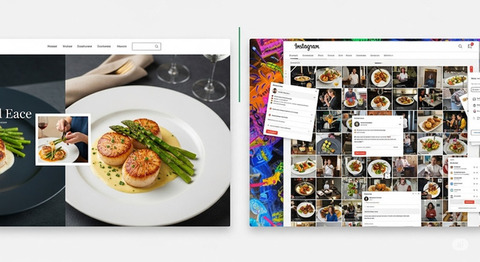
Myth 1: “Just slap on an Instagram feed.

While embedding your Instagram feed might seem like an easy way to keep your site visually dynamic, it often ends up feeling like an afterthought. Worse, it creates a dead-end user experience, visitors click, get distracted by Instagram, and leave your site.

What actually works

  • Clickable, curated images: Instead of dumping the whole feed, handpick a few recent images and link each to relevant pages, like a featured dish leading to your menu, or a behind-the-scenes shot linking to your about page. This turns passive visuals into active pathways.

  • User-generated content in context: Rather than show it all in a generic carousel, place a customer photo next to their favorite menu item, or quote a review next to a booking button. You don’t just “show off”! You create trust by weaving the social proof into the journey.

  • Prompting participation: Subtle prompts like “Tag us to be featured” or “Use #DineAtLuna” can turn casual diners into active brand advocates. Bonus: this fuels your content pipeline without burning out your team.

  • Social meta tags: When someone shares your homepage or menu link on Facebook or X, what image shows up? What headline? With proper Open Graph and Twitter card setup, you control the story making every share feel intentional and attractive.

Bottom line?

A social-friendly website doesn’t broadcast at people. It creates tiny doorways for them to step in and participate.

Myth 2: “Your website needs to feel like TikTok.

Not every platform needs to mimic Gen Z’s favorite app. Your website is not meant to entertain endlessly, it’s there to convert intent into action. Visitors come with a purpose: to browse your menu, book a table, or get a sense of your vibe.

What actually works

  • Snappy copy: A few well-chosen words, crisp, flavorful, personality-packed can do more than a minute-long video. A dish name like “Crackling Five-Spice Duck” paired with a 10-word punchline sells better than any looping Reel.

  • Short video loops: Strategically placed 5–10 second videos showing a cocktail being poured or flames searing a steak add movement without chaos. Silent autoplay with hover sound ensures they’re subtle, not intrusive, perfect for desktop and mobile alike.

  • Micro-interactions: Thoughtful hover states, smooth transitions, and clean animations elevate the feel of the site making it feel “alive” without shouting. It's not about motion for motion’s sake — it’s about intuitive flow.

  • Optimized mobile layout: The real “social-first” challenge isn’t viral features, it’s performance. A social-friendly site loads fast, adapts seamlessly to thumbs, and presents key actions (like “Order Now” or “Book Table”) without a scroll hunt.

Great UX isn’t about chasing the trend. It’s about meeting expectation and exceeding it quietly.

Myth 3: “The louder your design, the better you convert.

While bold colors and edgy layouts can turn heads, they can also overwhelm. Visitors don’t want to “explore your world” — they want to eat. And if your site hides the essentials behind parallax scrolls and animated intros, they’ll bounce.

What actually works

  • Clean sectioning: Structure the site around what people care about. It's your food, your story, how to visit, and how to book. Give each section breathing space and clear navigation anchors. When someone clicks from your Instagram bio, they should land exactly where the interest is, not guess through a homepage maze.

  • Contextual callouts: Instead of overwhelming users with random widgets or pop-ups, strategically highlight real customer reviews next to top dishes. Or pull in your Google rating under your booking form. Every element should support trust, not distract from it.

  • Dynamic, but manageable content: You don’t need to update daily, but you do need to stay current. A site like Nilead gives you tools to update promotions, switch featured dishes, or add new photos without breaking your layout, ensuring freshness without fatigue.

A modern design doesn’t need to be maximalist. It just needs to be clear, confident, and connected.

Where Nilead fits in naturally

The beauty of Nilead isn’t just in what it builds, it’s in what it enables.

With built-in features like:

  • Custom social-sharing previews (so every link tells your story beautifully)

  • SEO + Open Graph integration (ready for both Google and Instagram)

  • Easy visual CMS (so you update media-rich content without touching code)

  • Dynamic blocks for testimonials, menus, and special offers

  • Social tagging and scheduling baked into your workflow

…you’re not forcing your website to be social.

You’re building it to be ready for search, for sharing, and for delight.

Takeaway

The myth is that social-friendliness comes from noise, gimmicks, or copying trends.

The truth is: it comes from clarity, intention, and structure.

Build your restaurant website like a great dining experience, inviting, thoughtful, and memorable. Let social media amplify it, not define it.

Discord chat

We're available Monday–Friday, security and critical bug fixes are available 24/7.

Facebook page

Get the latest news and updates regarding Nilead platform and services.