


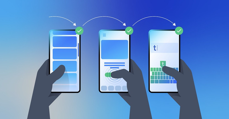
Smartphones have transitioned from being mere communication tools to the primary gateways of information and entertainment. With this paradigm shift, User Experience (UX) Design in mobile web development has surged in importance. It's no longer about just having a mobile presence—it's about offering a seamless, engaging, and intuitive user journey.
Why Prioritize UX in Mobile Web Design
A compelling UX doesn't just retain users—it converts them. According to Nilead's content strategy article, users' expectations of mobile web experiences have skyrocketed. In today's fast-paced digital ecosystem, the difference between a successful and an average mobile site can boil down to its user experience.
For instance, Amazon has made it exceedingly straightforward for users to search, view, and purchase items on their mobile platform. Their focus on reducing friction in the mobile shopping journey has been a cornerstone of their success.

Decoding Mobile UX Best Practices
Understanding User-Centered Mobile Design: At the core of any successful design is its audience. Spotify is an exemplar here. By understanding users' musical tastes and listening habits, they curate personalized playlists, enhancing user engagement and satisfaction.
Invest in tools like Google Analytics to gain insights into user behavior. Run surveys or A/B tests to understand their preferences and pain points.
Touch-Friendly Design Principles:

Samsung's One UI, for their smartphones, was redesigned to make it more ergonomic and touch-friendly, especially for one-handed use. This change was a direct response to user feedback. To understand where users most frequently interact with your mobile web, tools like heatmaps can be invaluable. Platforms like Hotjar provide heatmap functionality to showcase which areas of your site users interact with the most, helping you refine touchpoints and improve user interactions.
Engage with Micro-Interactions: Facebook and Instagram have perfected this with their "like" and "heart" animations, turning an ordinary interaction into a delightful moment. Tools like Framer can help designers craft delightful micro-interactions, turning mundane tasks into engaging experiences.
Evoke Emotion with Design: Delve into emotional design by studying your audience's demographics, cultural preferences, and values. Consider integrating elements that resonate with their emotional triggers, whether it's nostalgia, humor, or inspiration.

The Roadmap to Optimizing Mobile User Journey
Mapping the Journey: Netflix provides a seamless user journey, from browsing shows to watching and even downloading. Their mobile experience minimizes steps, reducing user drop-off.
Use tools like Journey Map to visualize the user's path through your mobile site. This aids in understanding drop-offs, bottlenecks, and opportunities for engagement.
Content that Resonates:

Nike's mobile site and app is a testament to this. With engaging visuals, compelling stories, and crisp product descriptions, they ensure users are not just browsing but also connecting with the brand. Mobile users often seek quick information. Use concise, engaging copy and visuals. Tools like Grammarly can help refine content, making it crisp and error-free.
Speed Optimization: Slow loading times can kill the user experience. Employ tools like Google's Mobile Speed Test to ensure your site loads swiftly.

Harnessing Feedback for Continuous Improvement

Tools like UsabilityHub allow you to gain insights directly from target users, guiding iterative design improvements.
Prototyping, Testing, and Refinement
Visualizing with Prototypes: Before diving into development, visualize with prototyping tools like Sketch or Adobe XD. This helps stakeholders get a feel for the end product and provides an opportunity for early feedback.
Ensuring Consistency: Don’t forget the importance of cross-browser compatibility. Ensure your mobile experience is consistent across diverse platforms and devices.
In Closing
The digital landscape is in constant flux. However, the need for an impeccable user experience, especially in mobile web design, remains a consistent imperative. Businesses that invest time, resources, and genuine effort into mastering mobile UX will not only meet but exceed user expectations, positioning themselves as leaders in the digital space.
Table of contents
About the author