Menu
Menu
Platform


Resources


Blog
Latest news about web design, development, marketing, etc.
Help Center
Help, tutorials, and tips on using our platform to promote your online business.
Features
Everything you need to build the perfect website.
FAQs
Frequently Asked Questions about NILEAD.
Choose Right Website Solutions
Which website solution to choose for you next project?
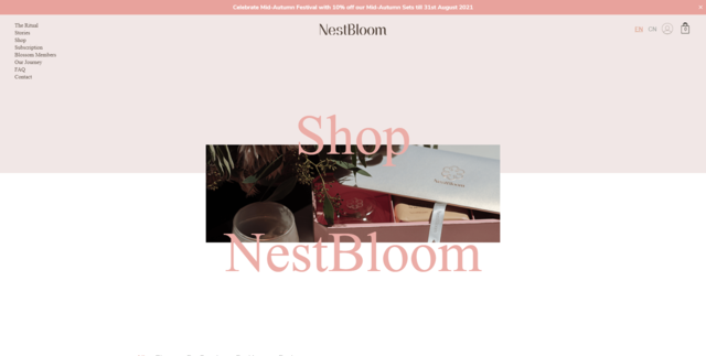
Projects
Check our latest projects that utilize Nilead platform.
Services
Website Development
We build and manage websites that combine great design with smart marketing to help your business grow online.
Website management
We manage and optimize your website to keep it secure, up to date, and performing at its best every day.
Digital Marketing
We use SEO and inbound marketing to build long-term visibility and customer relationships for your business.
AI Marketing Manager
Our AI Manager learns your brand, builds a clear plan, and puts your results on autopilot.
Dedicated Full Stack Developer
Tired of unreliable freelancers? Get expert, supervised support that integrates with your team.